

Misc
Mapped: The 3 Billion People Who Can’t Afford a Healthy Diet
VC+ members get access to our World at 8 Billion Report.
Gain access to this exclusive new report and webinar by becoming a VC+ member.
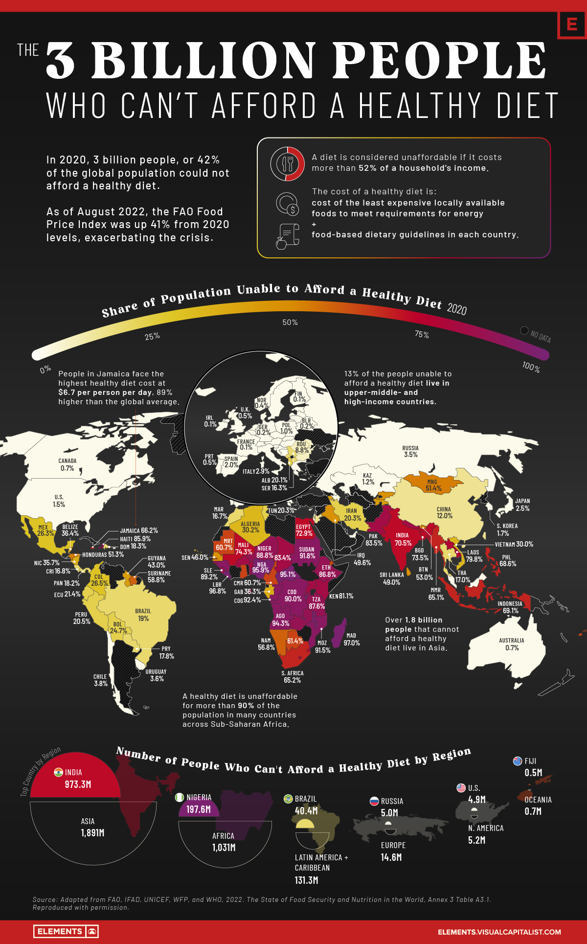
The 3 Billion People Who Can’t Afford a Healthy Diet
While they aren’t often the focus of news media, hunger and undernourishment are problems plaguing millions of people every day.
According to the UN Food and Agriculture Organization (FAO), more than 3 billion people could not afford a healthy diet in 2020, an additional 112 million more people than in 2019. The increase was partly because of rising food prices, with the average cost of a healthy diet rising by 3.3% from 2019 levels.
As of August 2022, the FAO food price index was up 40.6% from average 2020 levels. Unless income levels increased by a similar magnitude, the healthy diet crisis is likely to have worsened, especially in low-income countries experiencing rampant food inflation.
Using data from the FAO, the above infographic maps the share of people unable to afford a healthy diet in 138 different countries as of 2020 (latest available data).
The Cost and Affordability of a Healthy Diet
According to the FAO, a healthy diet is one that meets daily energy needs as well as requirements within the food and dietary guidelines created by the country.
The (un)affordability is measured by comparing the cost of a healthy diet to income levels in the country. If the cost exceeds 52% of an average household’s income, the diet is deemed unaffordable.
Here’s a look at the share of populations unable to afford a healthy diet, and the cost of such a diet around the world:
| Country | Percent of population unable to afford a healthy diet | Cost of Healthy Diet (USD per Person per Day) |
|---|---|---|
| Burundi 🇧🇮 | 97.2% | $2.9 |
| Madagascar 🇲🇬 | 97.0% | $3.2 |
| Liberia 🇱🇷 | 96.8% | $3.9 |
| Malawi 🇲🇼 | 96.6% | $3.1 |
| Nigeria 🇳🇬 | 95.9% | $4.1 |
| Central African Republic 🇨🇫 | 95.1% | $3.6 |
| Guinea 🇬🇳 | 94.9% | $4.1 |
| Angola 🇦🇴 | 94.3% | $4.5 |
| Congo 🇨🇬 | 92.4% | $3.4 |
| Sudan 🇸🇩 | 91.8% | $4.3 |
| Mozambique 🇲🇿 | 91.5% | $3.2 |
| Democratic Republic of Congo 🇨🇩 | 90.0% | $2.1 |
| Sierra Leone 🇸🇱 | 89.2% | $2.9 |
| Niger 🇳🇪 | 88.8% | $2.9 |
| Zambia 🇿🇲 | 88.0% | $3.3 |
| Tanzania 🇹🇿 | 87.6% | $2.7 |
| Guinea-Bissau 🇬🇼 | 87.2% | $3.5 |
| Ethiopia 🇪🇹 | 86.8% | $3.4 |
| Rwanda 🇷🇼 | 86.3% | $2.7 |
| Haiti 🇭🇹 | 85.9% | $4.5 |
| Sao Tome and Principe 🇸🇹 | 84.7% | $3.6 |
| Nepal 🇳🇵 | 84.0% | $4.4 |
| Lesotho 🇱🇸 | 83.5% | $4.3 |
| Pakistan 🇵🇰 | 83.5% | $3.7 |
| Chad 🇹🇩 | 83.4% | $2.8 |
| Benin 🇧🇯 | 82.9% | $3.7 |
| Uganda 🇺🇬 | 82.2% | $2.7 |
| Kenya 🇰🇪 | 81.1% | $3.0 |
| Burkina Faso 🇧🇫 | 80.1% | $3.3 |
| Laos 🇱🇦 | 79.8% | $4.1 |
| Mali 🇲🇱 | 74.3% | $3.1 |
| Bangladesh 🇧🇩 | 73.5% | $3.1 |
| Egypt 🇪🇬 | 72.9% | $3.4 |
| Eswatini 🇸🇿 | 71.8% | $3.4 |
| India 🇮🇳 | 70.5% | $3.0 |
| Indonesia 🇮🇩 | 69.1% | $4.5 |
| Philippines 🇵🇭 | 68.6% | $4.1 |
| Jamaica 🇯🇲 | 66.2% | $6.7 |
| South Africa 🇿🇦 | 65.2% | $4.3 |
| Myanmar 🇲🇲 | 65.1% | $4.2 |
| Gambia 🇬🇲 | 64.0% | $3.1 |
| Djibouti 🇩🇯 | 63.9% | $3.1 |
| Botswana 🇧🇼 | 61.4% | $3.7 |
| Ghana 🇬🇭 | 61.2% | $4.0 |
| Cameroon 🇨🇲 | 60.7% | $2.8 |
| Mauritania 🇲🇷 | 60.7% | $3.7 |
| Fiji 🇫🇯 | 60.4% | $3.9 |
| Suriname 🇸🇷 | 58.8% | $5.7 |
| Namibia 🇳🇦 | 56.8% | $3.5 |
| Bhutan 🇧🇹 | 53.0% | $5.0 |
| Mongolia 🇲🇳 | 51.4% | $5.1 |
| Honduras 🇭🇳 | 51.3% | $3.5 |
| Iraq 🇮🇶 | 49.6% | $3.5 |
| Kyrgyzstan 🇰🇬 | 49.6% | $3.2 |
| Sri Lanka 🇱🇰 | 49.0% | $3.9 |
| Senegal 🇸🇳 | 46.0% | $2.3 |
| Guyana 🇬🇾 | 43.0% | $4.9 |
| Armenia 🇦🇲 | 42.9% | $3.2 |
| Tajikistan 🇹🇯 | 42.1% | $3.5 |
| Cabo Verde 🇨🇻 | 38.1% | $3.6 |
| Belize 🇧🇿 | 36.4% | $2.1 |
| Gabon 🇬🇦 | 36.3% | $3.6 |
| Nicaragua 🇳🇮 | 35.7% | $3.3 |
| Algeria 🇩🇿 | 30.2% | $3.8 |
| Vietnam 🇻🇳 | 30.0% | $4.1 |
| Colombia 🇨🇴 | 26.5% | $3.1 |
| Mexico 🇲🇽 | 26.3% | $3.3 |
| Bolivia 🇧🇴 | 24.7% | $3.8 |
| Palestine 🇵🇸 | 23.1% | $3.4 |
| Ecuador 🇪🇨 | 21.4% | $2.9 |
| Saint Lucia 🇱🇨 | 20.6% | $3.6 |
| Peru 🇵🇪 | 20.5% | $3.3 |
| Iran 🇮🇷 | 20.3% | $3.6 |
| Tunisia 🇹🇳 | 20.3% | $3.6 |
| Albania 🇦🇱 | 20.1% | $4.2 |
| Brazil 🇧🇷 | 19.0% | $3.1 |
| Dominican Republic 🇩🇴 | 18.3% | $3.9 |
| Panama 🇵🇦 | 18.2% | $4.5 |
| North Macedonia 🇲🇰 | 18.0% | $3.4 |
| Paraguay 🇵🇾 | 17.8% | $3.5 |
| Montenegro 🇲🇪 | 17.5% | $3.5 |
| Thailand 🇹🇭 | 17.0% | $4.3 |
| Costa Rica 🇨🇷 | 16.8% | $4.1 |
| Morocco 🇲🇦 | 16.7% | $2.8 |
| Serbia 🇷🇸 | 16.3% | $4.2 |
| Jordan 🇯🇴 | 14.9% | $3.6 |
| Mauritius 🇲🇺 | 13.5% | $3.6 |
| China 🇨🇳 | 12.0% | $3.0 |
| Trinidad and Tobago 🇹🇹 | 11.6% | $4.2 |
| Romania 🇷🇴 | 8.8% | $3.2 |
| Bulgaria 🇧🇬 | 8.5% | $4.1 |
| Seychelles 🇸🇨 | 6.8% | $3.8 |
| Moldova 🇲🇩 | 6.7% | $2.8 |
| Chile 🇨🇱 | 3.8% | $3.4 |
| Croatia 🇭🇷 | 3.8% | $4.3 |
| Bosnia and Herzegovina 🇧🇦 | 3.7% | $4.0 |
| Uruguay 🇺🇾 | 3.6% | $3.4 |
| Russia 🇷🇺 | 3.5% | $3.4 |
| Greece 🇬🇷 | 3.2% | $3.1 |
| Italy 🇮🇹 | 2.9% | $3.1 |
| Japan 🇯🇵 | 2.5% | $5.8 |
| Hungary 🇭🇺 | 2.0% | $3.5 |
| Spain 🇪🇸 | 2.0% | $2.8 |
| Malaysia 🇲🇾 | 1.9% | $3.5 |
| Latvia 🇱🇻 | 1.8% | $3.2 |
| South Korea 🇰🇷 | 1.7% | $5.2 |
| United States 🇺🇸 | 1.5% | $3.4 |
| Maldives 🇲🇻 | 1.4% | $3.9 |
| Estonia 🇪🇪 | 1.3% | $3.3 |
| Kazakhstan 🇰🇿 | 1.2% | $2.7 |
| Lithuania 🇱🇹 | 1.2% | $3.1 |
| Slovakia 🇸🇰 | 1.2% | $3.2 |
| Israel 🇮🇱 | 1.0% | $2.5 |
| Poland 🇵🇱 | 1.0% | $3.2 |
| Austria 🇦🇹 | 0.8% | $3.0 |
| Australia 🇦🇺 | 0.7% | $2.6 |
| Canada 🇨🇦 | 0.7% | $3.0 |
| Malta 🇲🇹 | 0.7% | $3.8 |
| Sweden 🇸🇪 | 0.6% | $3.3 |
| Portugal 🇵🇹 | 0.5% | $2.7 |
| United Kingdom 🇬🇧 | 0.5% | $1.9 |
| Denmark 🇩🇰 | 0.4% | $2.5 |
| Norway 🇳🇴 | 0.4% | $3.5 |
| Cyprus 🇨🇾 | 0.3% | $3.0 |
| Belarus 🇧🇾 | 0.2% | $3.3 |
| Belgium 🇧🇪 | 0.2% | $3.1 |
| Czechia | 0.2% | $3.0 |
| Germany 🇩🇪 | 0.2% | $3.0 |
| Netherlands 🇳🇱 | 0.2% | $3.0 |
| Finland 🇫🇮 | 0.1% | $2.7 |
| France 🇫🇷 | 0.1% | $3.2 |
| Ireland 🇮🇪 | 0.1% | $2.2 |
| Luxembourg 🇱🇺 | 0.1% | $2.7 |
| Slovenia 🇸🇮 | 0.1% | $3.1 |
| Azerbaijan 🇦🇿 | 0.0% | $2.5 |
| Iceland 🇮🇸 | 0.0% | $2.4 |
| Switzerland 🇨🇭 | 0.0% | $2.7 |
| United Arab Emirates 🇦🇪 | 0.0% | $3.1 |
| World 🌎 | 42.0% | $3.5 |
In 52 countries, more than half of the population cannot afford a healthy diet. The majority of these are in Africa, with the rest located across Asia, Oceania, and the Americas.
By contrast, in four countries—Azerbaijan, Iceland, Switzerland, and the UAE—everyone is able to afford a healthy diet. The picture is similar for most European and developed high-income countries, where more than 95% of the population can afford a healthy diet.
When the percentages are translated into numbers, Asia contains the most number of people unable to afford a healthy diet at 1.89 billion, of which 973 million people are in India alone. Another 1 billion people are in Africa, with around 151 million people in the Americas and Oceania.
While hunger is a worldwide concern, it is particularly acute in African countries, which cover all of the top 20 spots in the above table.
Africa’s Deepening Food Crisis
In many countries across sub-Saharan Africa, more than 90% of the population cannot afford a healthy diet.
Sub-Saharan Africa is particularly susceptible to extreme climate events and the resulting volatility in food prices. Roughly one-third of the world’s droughts occur in the region, and some sub-Saharan countries are also heavily reliant on imports for food.
Russia’s invasion of Ukraine has deepened the crisis, with many African countries importing over 50% of their wheat from the two countries in conflict. The rising food prices from this supply chain disruption have resulted in double-digit food inflation in many African nations, which means that more people are likely to be unable to afford healthy diets.
The Horn of Africa region at the Eastern tip of Africa is particularly in turmoil. All the countries in the region are reliant on wheat from Russia and Ukraine, with Eritrea (100%) and Somalia (>90%) high up in the import dependency chart. Additionally, the region is facing its worst drought in 40 years alongside ongoing political conflicts. As a result, 22 million people are at risk of starvation.
Population Growth and Food Insecurity
In November of 2022, the global population is projected to surpass 8 billion people, and many of the fastest growing countries are also food-insecure.
By 2050, the global population is likely to increase by 35%, and to meet the growing demand for food, crop production will need to double. Given that agriculture is one of the biggest contributors to greenhouse gas emissions, this increase in crop production will also need to be environmentally sustainable.
As the impacts of climate change intensify and food demand increases, reducing food waste, building climate-resilient agricultural infrastructure, and improving agricultural productivity will all play a key role in reducing the levels of food insecurity sustainably.


Misc
Brass Rods: The Secure Choice
This graphic shows why brass rods are the secure choice for precision-machined and forged parts.
Brass Rods: The Secure Choice
The unique combination of machinability and recyclability makes brass rods the secure choice for manufacturers seeking future-proof raw material solutions.
This infographic, from the Copper Development Association, shows three ways brass rods give manufacturers greater control and a license to grow in the competitive market for precision-machined and forged products.
Future-Proof Investments in New Machine Tools
A material’s machinability directly impacts machine throughput, which typically has the largest impact on machine shop profitability.
The high-speed machining capabilities of brass rods maximize machine tool performance, allowing manufacturers to run the material faster and longer without sacrificing tool life, chip formation, or surface quality.
The high machining efficiency of brass leads to reduced per-part costs, quicker return on investment (ROI) for new machine tools, and expanded production capacity for new projects.
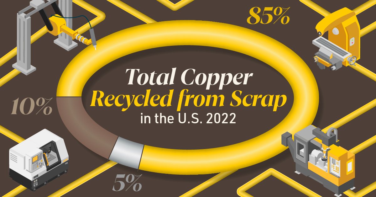
Supply Security Through Closed Loop Recycling
Brass, like its parent element copper, can be infinitely recycled.
In 2022, brass- and wire-rod mills accounted for the majority of the 830,000 tonnes of copper recycled from scrap in the U.S.
Given that scrap ratios for machined parts typically range from 60-70% by weight, producing mills benefit from a secure and steady supply of clean scrap returned directly from customers, which is recycled to create new brass rods.
The high residual value of brass scrap creates a strong recycling incentive. Scrap buy back programs give manufacturers greater control over raw material net costs as scrap value is often factored into supplier purchase agreements.
Next Generation Alloys for a Lead-Free Future
Increasingly stringent global regulations continue to pressure manufacturers to minimize the use of materials containing trace amounts of lead and other harmful impurities.
The latest generation of brass-rod alloys is engineered to meet the most demanding criteria for lead leaching in drinking water and other sensitive applications.
Seven brass-rod alloys passed rigorous testing to become the only ‘Acceptable Materials’ against lower lead leaching criteria recently adopted in the national U.S. drinking water quality standard, NSF 61.
Learn more about the advantages of brass rods solutions.
Misc
Brass Rods: The Safe Choice
From airbags to firefighting equipment, components made from brass rods play a vital role in creating a safer environment.
Brass Rods: The Safe Choice
From airbags to firefighting equipment, components made from brass rods play a vital role in creating a safer environment.
This infographic from the Copper Development Association illustrates three use cases for brass. This is the first of three infographics in our Choose Brass series.
Why Brass?
Brass is one of the most reliable metals for industrial and other applications. It contains little to no iron, protecting it from oxidation, which can cause other materials to fail over time.
Additionally, the malleability of brass ensures tight and leak-free metal-to-metal seals for threaded joints, minimizing the risk of costly and dangerous system failures. Brass’s durability ensures critical system components function properly for years.
Brass for Safe Water Systems
Exposure to lead in water can cause various health problems, including neurological damage, developmental delays, and cardiovascular diseases.
As a result, the U.S. sets minimum health-effect requirements for chemical contaminants and impurities indirectly transferred to drinking water from products, components, and materials used in water systems.
Currently, only brass rod alloys are designated as “acceptable materials” according to national standards.
Brass is also essential for ensuring workplace safety, particularly in high-risk manufacturing environments.
Using Brass for Safe Manufacturing and Industrial Environments
Brass is used extensively in industrial applications such as machinery components, valves, fittings, architectural elements, bearings, and gears.
The machinability of brass rods also means longer tool life and higher productivity for manufacturers of precision parts.
The microstructure of brass helps break up metal chips generated during machining operations, preventing long and stringy chips that can crash machines and seriously injure operators.
Additionally, brass’s non-sparking properties make it ideal for tooling, fittings, and components in high-risk industries such as oil & gas, chemicals, pharmaceuticals, paint manufacturing, power plants, and explosives.
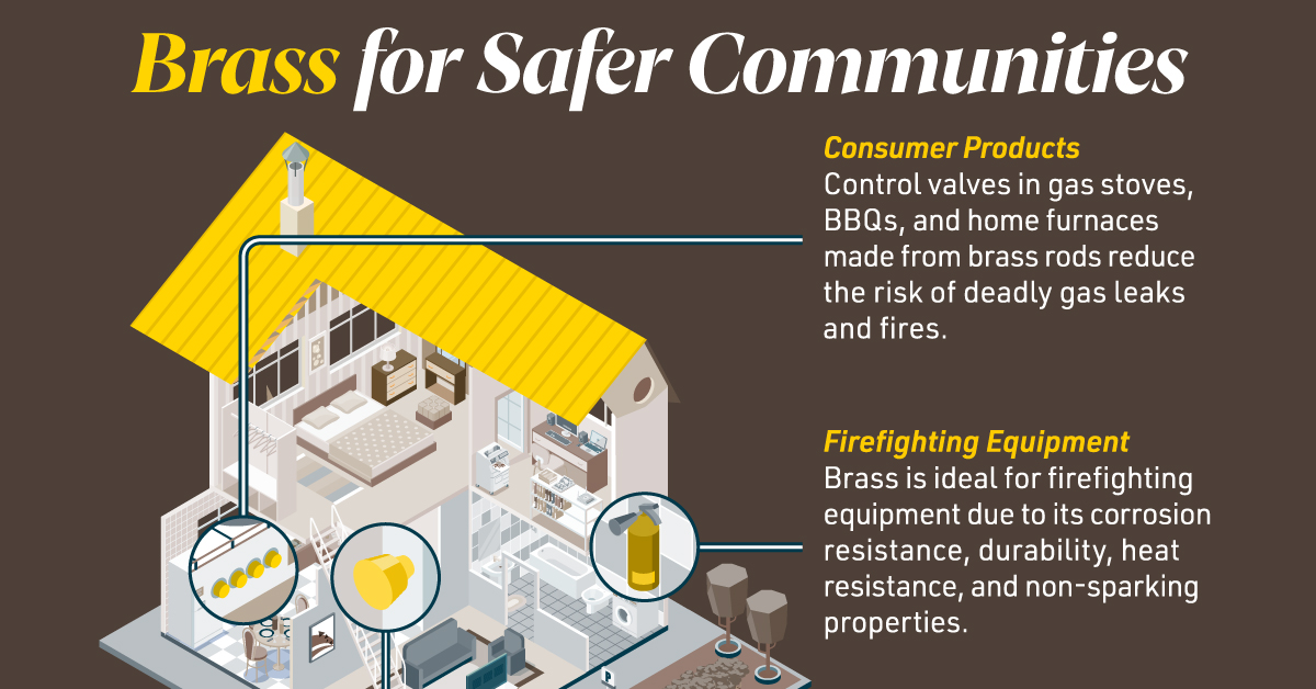
Brass for Safer Communities
Many pieces of equipment in our daily lives also rely on brass rod parts to function. Control valves in gas stoves, BBQs, and home furnaces made from brass rods reduce the risk of deadly gas leaks and fires.
Moreover, brass is ideal for firefighting equipment due to its corrosion resistance, durability, heat resistance, and non-sparking properties.
Fittings made from brass rods ensure that the brakes and airbags in our vehicles work when needed.
Brass and other copper-based alloys are also naturally antimicrobial, helping prevent diseases when used in high-touch surfaces such as door handles.
These are only some of the ways that brass rods help build a safer world for everyone.
Explore the Advantages of Brass Rod Solutions.
-
 Electrification3 years ago
Ranked: The Top 10 EV Battery Manufacturers
-
 Electrification2 years ago
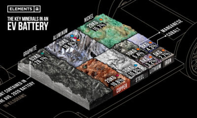
The Key Minerals in an EV Battery
-
 Real Assets3 years ago
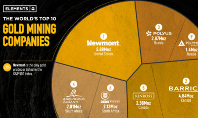
The World’s Top 10 Gold Mining Companies
-
 Misc3 years ago
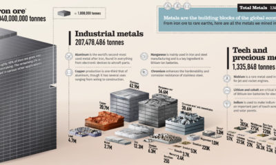
All the Metals We Mined in One Visualization
-
 Electrification3 years ago
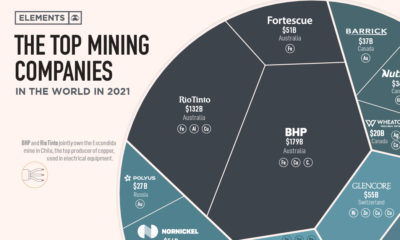
The Biggest Mining Companies in the World in 2021
-
 Energy Shift2 years ago
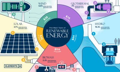
What Are the Five Major Types of Renewable Energy?
-

 Electrification2 years ago
Mapped: Solar Power by Country in 2021
-
 Electrification2 years ago
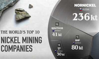
The World’s Largest Nickel Mining Companies