

Energy Shift
The Solar Power Duck Curve Explained
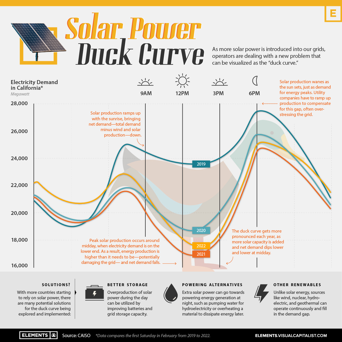
The Solar Power Duck Curve Explained
With the increasing demand for electricity as the world shifts away from fossil fuels, cleaner sources of energy like solar and wind are becoming more and more common.
However, as more solar power is introduced into our grids, operators are dealing with a new problem that can be visualized as the “duck curve.”
Origins of the Duck Curve
In a world heavily reliant on electricity, utility companies have gotten better at using data to anticipate demand and trying to operate as efficiently as possible.
Usually, power companies supply the least amount of power overnight while most consumers are sleeping, ramping up during the morning as people wake up and businesses get going. Then, at sunset, energy demand peaks.
Utility companies use models to predict demand and operate as efficiently as possible by supplying more power during times of higher demand. But the introduction of solar power has brought about problems in these demand curve models.
Since solar power relies on the Sun, peak solar production occurs around midday, when electricity demand is often on the lower end. As a result, energy production is higher than it needs to be, and net demand—total demand minus wind and solar production—falls. Then, when evening approaches, net demand increases, while solar power generation falls.
This discrepancy results in a net demand curve that takes the shape of a duck, and the duck curve gets more pronounced each year, as more solar capacity is added and net demand dips lower and lower at midday.
Why the Curve is Ruffling Feathers
The drop in net demand at midday basically creates two problems:
- Solar energy production wanes as the sun sets, just as demand for energy typically peaks. Utility companies are having to ramp up production to compensate for this gap, often overstressing a grid that is not yet set up for these peaks.
- Traditional sources of energy like nuclear and coal are only economic when they are running all the time. If you have to turn them off at mid-day because the power is supplied by solar, they become economically unfeasible.
Due to overproduction, solar power is already being wasted in some places where the technology is widely used, like California.
The problem is most intense during summer or spring when part of the solar panels has to be turned off to avoid overloading or even damaging the power grid.
Flattening the Duck
With more countries starting to rely on solar power, there are many potential solutions for the duck curve being explored (and implemented):
- Energy Storage: Overproduction of solar power during the day can be utilized by improving batteries and grid storage capacity.
- Powering Alternatives: Extra solar power can go towards powering energy generation at night, such as pumping water for hydroelectricity or overheating a material to dissipate energy later.
- Other Clean Sources: Unlike solar energy, sources like nuclear, hydroelectric, and geothermal can operate continuously and fill in the demand gap.
While grid managers study how to serve the new supply and demand, the duck curve is one of the greatest challenges facing renewable energy.


Energy Shift
The World’s Biggest Oil Producers in 2023
Just three countries accounted for 40% of global oil production last year.
The World’s Biggest Oil Producers in 2023
This was originally posted on our Voronoi app. Download the app for free on iOS or Android and discover incredible data-driven charts from a variety of trusted sources.
Despite efforts to decarbonize the global economy, oil still remains one of the world’s most important resources. It’s also produced by a fairly limited group of countries, which can be a source of economic and political leverage.
This graphic illustrates global crude oil production in 2023, measured in million barrels per day, sourced from the U.S. Energy Information Administration (EIA).
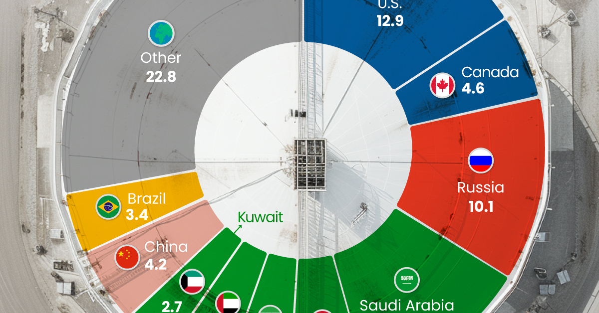
Three Countries Account for 40% of Global Oil Production
In 2023, the United States, Russia, and Saudi Arabia collectively contributed 32.7 million barrels per day to global oil production.
| Oil Production 2023 | Million barrels per day |
|---|---|
| 🇺🇸 U.S. | 12.9 |
| 🇷🇺 Russia | 10.1 |
| 🇸🇦 Saudi Arabia | 9.7 |
| 🇨🇦 Canada | 4.6 |
| 🇮🇶 Iraq | 4.3 |
| 🇨🇳 China | 4.2 |
| 🇮🇷 Iran | 3.6 |
| 🇧🇷 Brazil | 3.4 |
| 🇦🇪 UAE | 3.4 |
| 🇰🇼 Kuwait | 2.7 |
| 🌍 Other | 22.8 |
These three nations have consistently dominated oil production since 1971. The leading position, however, has alternated among them over the past five decades.
In contrast, the combined production of the next three largest producers—Canada, Iraq, and China—reached 13.1 million barrels per day in 2023, just surpassing the production of the United States alone.
In the near term, no country is likely to surpass the record production achieved by the U.S. in 2023, as no other producer has ever reached a daily capacity of 13.0 million barrels. Recently, Saudi Arabia’s state-owned Saudi Aramco scrapped plans to increase production capacity to 13.0 million barrels per day by 2027.
In 2024, analysts forecast that the U.S. will maintain its position as the top oil producer. In fact, according to Macquarie Group, U.S. oil production is expected to achieve a record pace of about 14 million barrels per day by the end of the year.
Energy Shift
How Much Does the U.S. Depend on Russian Uranium?
Despite a new uranium ban being discussed in Congress, the U.S. is still heavily dependent on Russian uranium.
How Much Does the U.S. Depend on Russian Uranium?
This was originally posted on our Voronoi app. Download the app for free on iOS or Android and discover incredible data-driven charts from a variety of trusted sources.
The U.S. House of Representatives recently passed a ban on imports of Russian uranium. The bill must pass the Senate before becoming law.
In this graphic, we visualize how much the U.S. relies on Russian uranium, based on data from the United States Energy Information Administration (EIA).
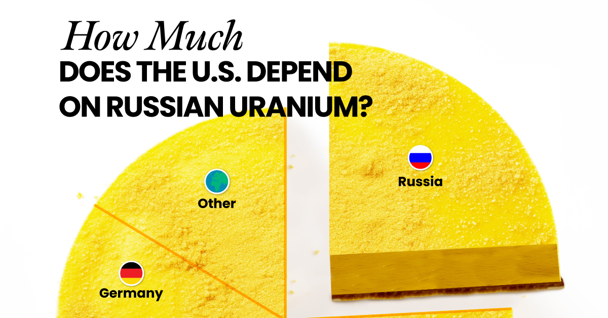
U.S. Suppliers of Enriched Uranium
After Russia invaded Ukraine, the U.S. imposed sanctions on Russian-produced oil and gas—yet Russian-enriched uranium is still being imported.
Currently, Russia is the largest foreign supplier of nuclear power fuel to the United States. In 2022, Russia supplied almost a quarter of the enriched uranium used to fuel America’s fleet of more than 90 commercial reactors.
| Country of enrichment service | SWU* | % |
|---|---|---|
| 🇺🇸 United States | 3,876 | 27.34% |
| 🇷🇺 Russia | 3,409 | 24.04% |
| 🇩🇪 Germany | 1,763 | 12.40% |
| 🇬🇧 United Kingdom | 1,593 | 11.23% |
| 🇳🇱 Netherlands | 1,303 | 9.20% |
| Other | 2,232 | 15.79% |
| Total | 14,176 | 100% |
SWU stands for “Separative Work Unit” in the uranium industry. It is a measure of the amount of work required to separate isotopes of uranium during the enrichment process. Source: U.S. Energy Information Administration
Most of the remaining uranium is imported from European countries, while another portion is produced by a British-Dutch-German consortium operating in the United States called Urenco.
Similarly, nearly a dozen countries around the world depend on Russia for more than half of their enriched uranium—and many of them are NATO-allied members and allies of Ukraine.
In 2023 alone, the U.S. nuclear industry paid over $800 million to Russia’s state-owned nuclear energy corporation, Rosatom, and its fuel subsidiaries.
It is important to note that 19% of electricity in the U.S. is powered by nuclear plants.
The dependency on Russian fuels dates back to the 1990s when the United States turned away from its own enrichment capabilities in favor of using down-blended stocks of Soviet-era weapons-grade uranium.
As part of the new uranium-ban bill, the Biden administration plans to allocate $2.2 billion for the expansion of uranium enrichment facilities in the United States.
-
 Electrification3 years ago
Ranked: The Top 10 EV Battery Manufacturers
-
 Electrification2 years ago
The Key Minerals in an EV Battery
-
 Real Assets3 years ago
The World’s Top 10 Gold Mining Companies
-
 Misc3 years ago
All the Metals We Mined in One Visualization
-
 Electrification3 years ago
The Biggest Mining Companies in the World in 2021
-
 Energy Shift2 years ago
What Are the Five Major Types of Renewable Energy?
-

 Electrification2 years ago
Mapped: Solar Power by Country in 2021
-
 Electrification2 years ago
The World’s Largest Nickel Mining Companies